Impressions of Australia 6

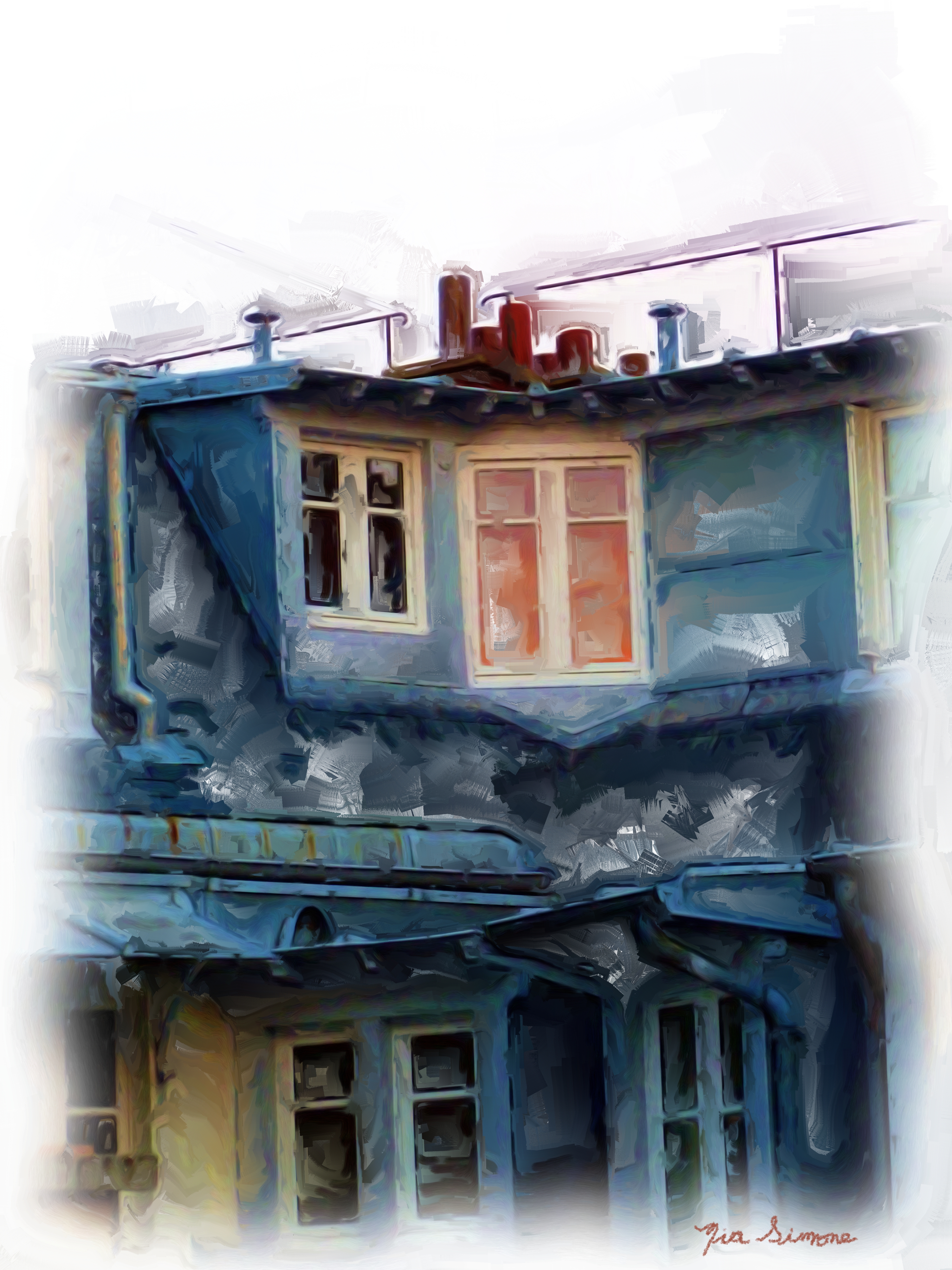
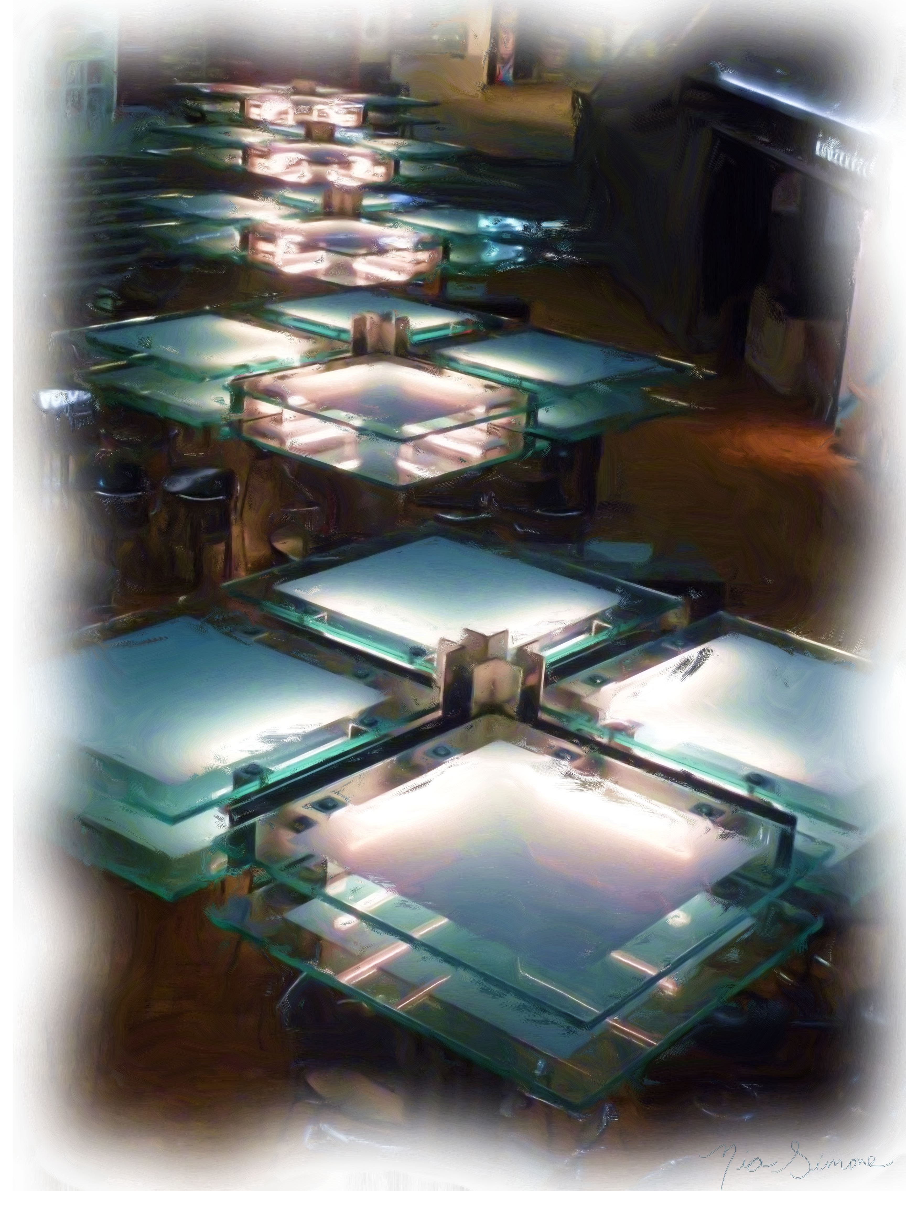
Melbourne, looking down at the top of the first floor lights in the mall connected to the Sofitel on Collins, rendered in oil via Corel Painting Essentials. I need to comment that the only reason I took this picture was because I had spent the day hanging around Leanne Cole. My only artistic objective in tagging around with her was to have her “eye” rub off on me. I didn’t seek any technical instruction, which was good, given that I forgot the battery charger for my DSLR and so was just using the compact.

P1060782_Oil_Painting

Here’s Maggie Island (I think) shot from the boat on the way back from our Great Barrier Reef tour.

P1050916_Painting

Impressions of Australia, 1

You’ve seen some of these before. These are digital paintings, though. These take some time to do so I’ll have to post them a couple at a time. These are Victoria.

P1060864_Painting

Here is the Port Lonsdale Pier again. You know what? After all that photo manipulation I tried yesterday, I decided to try Corel Painting Essentials today and I like this one the most.

DSC00239_Painting

I took this at night in Melbourne. It is a blurry photo but for a painting that doesn’t matter so much.

Melbourne
Melbourne

Port Lonsdale pier Victoria Australia revisited

I posted before on Port Lonsdale pier here. I have a lightweight version of Photoshop (Essentials) and wasn’t able to export the RAW to jpg again. That first time was kind of an accident! Now I have a bit of software available from Sony for my camera that allows me to open a RAW file, fiddle a bit, and export to jpg. Well, I still don’t have a lot of control, but I kind of like these anyway.

On this one I specified a gray point, whatever that means, but I shifted the color a bit. Took out some blues.

SONY DSC

This one is a different angle on the pier. I warmed it slightly. Then I applied a “creative effect” called landscape. Then I quickly typed here what I was doing so I wouldn’t forget. Then I adjusted something called a D-range Optimizer where I added +17 to the Amount of highlighting. (Shrugs.) Then I lowered the highlighting a lot and raised the shadows a little, managing to reduce some of the white foam in the waves. Well, then I switched from landscape to nightview in the Creative Style, applied some noise reduction and voila.

SONY DSC

Then again, here’s the original:

SONY DSCIs the fiddled-with one better?… Looking at WordPress Preview…

Looks about the same, ha ha!

I might need to take a class.

The Rijksmuseum, Amsterdam, series 2 (Van Gogh)

I used to think Van Gogh had a loose style. After seeing the paintings up close, I no longer think so. Although the images are constructed of many individual strokes of color, each of those  paint strokes is carefully and deliberately applied. In this painting, see how the paint strokes are directional, showing different overall directions in the jacket.

Van Gogh Self Portrait at field easelVan Gogh Self Portrait at field easel

Here are close ups:

Van Gogh Self Portrait using a field easel detail jacket
Van Gogh Self Portrait using a field easel detail palette

The next one’s blurry, but bear with me, the detailed shots turned out better.

Van Gogh Self Portrait

These turned out better:

Van Gogh Self Portrait detail enhanced
Van Gogh Self Portrait detail enhanced 2

The Rijksmuseum, Amsterdam, series 1

I loved the Rijksmuseum. The layout is orderly, lots of light, the museum isn’t too big and the galleries are very spacious. But if you go out to get lunch at the cafe, realize that you have left the museum and have to get in line to get back in again. Nice cafe, though. But a bit crowded. The best thing about the museum is the art. Gorgeous.

Dutch Ships in the Calm William Van de Velde
Dutch Ships in a Calm William Van de Velde

Dutch Ships info

Cornelis Cornelisz. The Fall 1592 1
Cornelis Cornelisz. The Fall 1592

Okay, here are some close ups because while I was in Amsterdam on the houseboat, I was doing a lot of digital painting on my Bamboo. And discovering how hard it is to do feet. Check out these toes. (I know the photos aren’t too sharp, sorry, but you have to work fast in a museum so as not to annoy people and you can’t use flash.)

Cornelis Cornelisz. The Fall detail 1

Then I was also trying to paint a torso from a life pose I had in an ebook I bought. Found out really fast how hard life drawing is. I spent about 20 hours on it and it didn’t turn out. Apparently, according to a friend who’s an artist, I need to take a life drawing class where they will teach me about anatomy and technique. Here’s what a stomach is supposed to look like:

Cornelis Cornelisz. The Fall detail 2

Check out this sculpture. You don’t see this kind of thing in every museum.

Greyhound Quellinus 1657
Greyhound, oak wood, Artus Quellinus 1657