California poppies (and art self-education)
The feature photo has no photo enhancement.
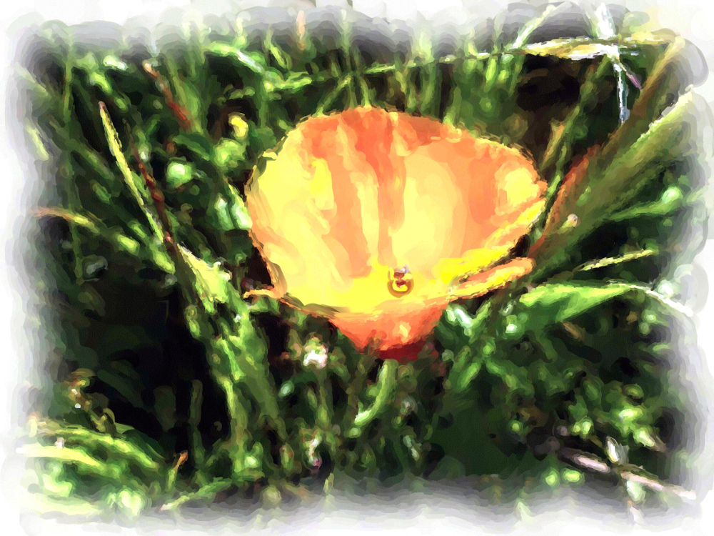
This is the same photo with Corel Painter Essentials Auto Painting->Detailed Watercolor applied. Beautiful but why…
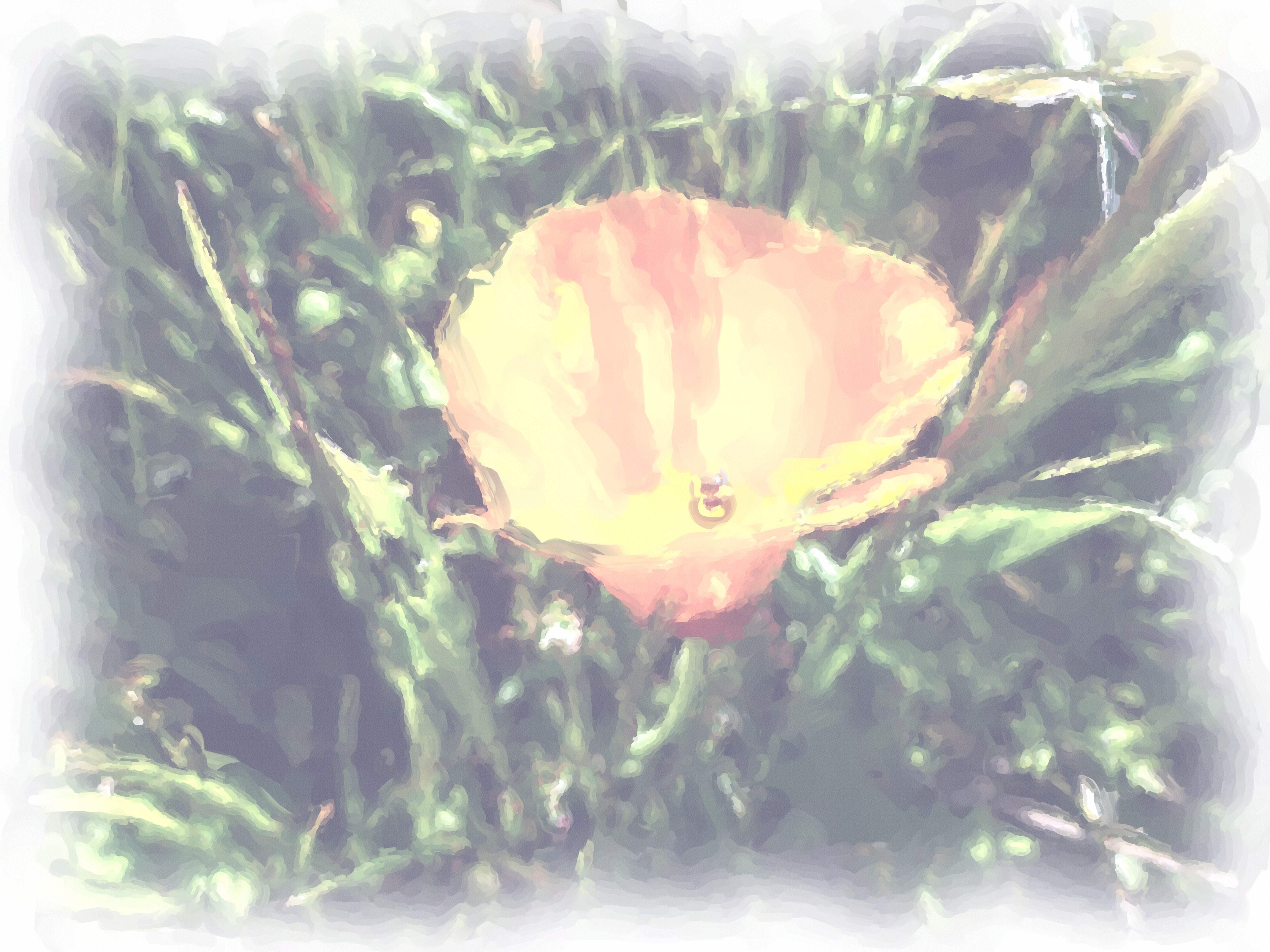
so faded? How to enrich it in Corel Painter Essentials, don’t know, so… (good ‘ol) GIMP, Colors->Auto->White Balance followed by Colors->Auto->Color Enhance. Satisfaction.
This next one has Photoshop Essentials Enhance->Auto Smart Fix applied because the poppy was too out of focus and this tool improved it enough to make the photo work. Intention was poppy in focus, grass blurry but opposite achieved. (Working with LCD display in bright sunlight without knowing the camera that well, and in a hurry.) Nonetheless, this composition makes the photographer happy.
 I
I
The (art) education of Nia Simone, stencils
Inspired by this fellow blogger and artist:
Pedro Holderbaum and especially this painting Menno, start studying stencils.
A link to a video about how to do it correctly: Four ways to do multi-colored stencils.
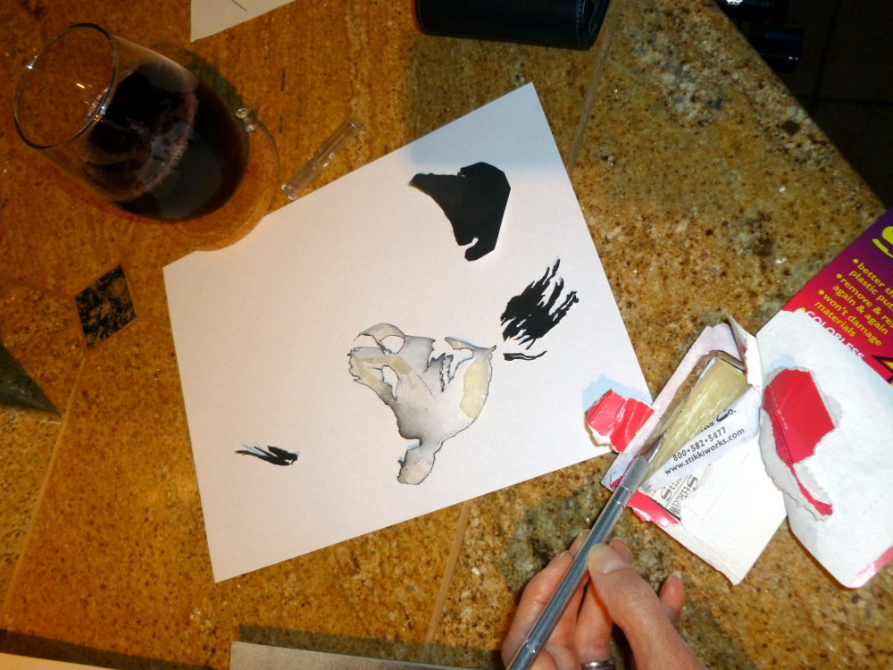
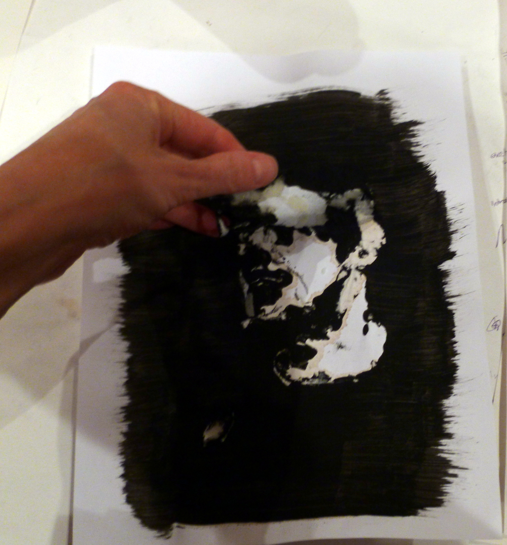
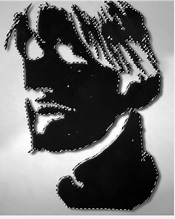
First stencil, step 3, stick it on (step 1 was getting a photo, turning it into black and white and increasing the contrast (see http://www.youtube.com/watch?v=SpcU0b_okv4) and printing, step 2 was cutting it out with an Exacto knife.)
Step 4. (Should be mowing this grass!)


Failure. Bleeding from overspray.

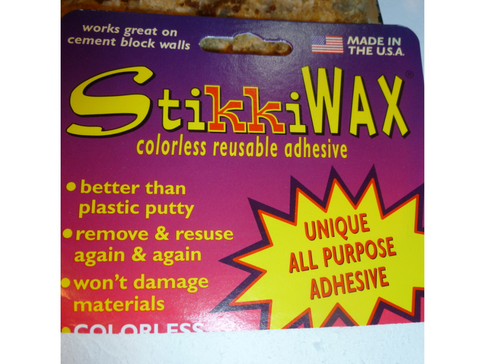
Step 3 again, this time using this cool wax you can get at the office supply (note the original stencil is black now):


The cool waxy stuff:
Step 4 again, this time with tempera paint:

Step 5, remove stencil, discover step 4 failure. Also ruined stencil.
***STARTING OVER***
Research how to do it completely with GIMP.
It didn’t work out exactly as described so here is documentation of the additional steps:
Thankfully have a photo of the spray-painted stencil, which is black now, and start with that. Make it a stencil using GIMP as described in completely with GIMP.
Thinking… Can I flip black and white? Should be simple. There’s something called Invert. Click. Nothing happens.
Struggle and experiment, use handy Select by Color (Tools->Selection Tools->Select by Color) to grab all the black.

Have dotted lines. Look in the Select menu. Find Float! Try that. (Note: This screen shot made by creating a new image, then File->Screenshot, selected The Whole Screen, then crop the result.)
It’s floating. Can it be dragged free of that background? Yes.

Now what? Click Edit->Copy. Now it’s in the clipboard.
Now create a new image, (1000×750, basic working size) and paste. Notice, probably didn’t have to move it off to the side as that actually had no effect. Just making it float was the key to detaching it from the background and copying it into the clipboard.
 I
I
It’s still floating. Can I invert it now? No. Instead, Tools->Selection Tools->Select by Color and click on the white part. Now white part is selected; you can’t tell, because the borders that are highlighted = borders of black, but it really is the white part, which you can tell when you do this: Edit->Fill with Pattern:
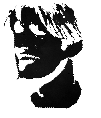
Do Tools->Selection Tools->Select by Colors again and click on the black part. Does Invert work now? No. That would be too easy. How about Edit->Fill with Background Color? Expecting the vinyl paneling in the stencil, get this instead, the whole point of the entire stenciling exercise!

Okay, can it be less white? Yes, but can’t remember how to make it gray. Did that somehow. (Will update this post when it’s re-discovered.)
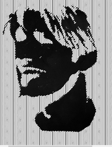
However, can now just Control C or Edit->Copy the floating image, open the background (purchased from canstockphoto for $3) and paste from the clipboard. The image is still floating. Drag it to where you want it.
Last step, anchor it. Could this be easy? Of course not. Go to Windows->Dockable Dialogs->Layers. Find the layer in the box to the right. First adjust the opacity down so it’s kind of transparent. Then, at the bottom of that dialog box, find the little anchor symbol and click it. Sometimes. Little anchor symbol was no longer there when this was written but it was there the first time. No hallucination… really, just had coffee. Whew, anchor also exists under the Layer menu.

Hint: If you accidentally lose the ability to move your floating level, go to Tools->Transform Tools->Move. That puts you back in move mode.
Conclusion: Since the spray painted stencil was less of a disaster than the tempera paint, sangria is better for art work than coffee.
The (art) education of Nia Simone, GIMP
Blogging brings new people and new things to try, like learning art, for now a self-education, but one day, who knows?
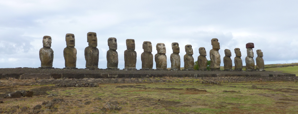
Today’s discovery: How to tone down the green after auto-enhancing the color in header photo.
Original photo:
To increase pop, perform Colors->Auto->White Enhance then Colors->Auto->Color Enhance:
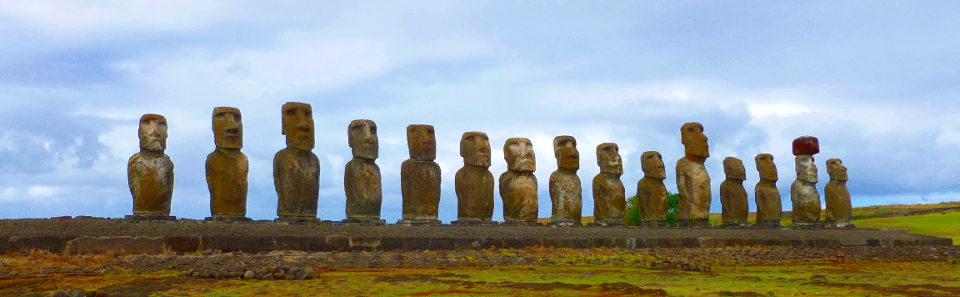
Too green. But… better than the washed-out original.
A week later, notice something called “Fade Color Enhance” appears in the Edit menu, but only after you have performed a color enhancement. If you perform a color enhancement, close the file and re-open it, you do not get this operation showing in the Edit menu.
Use Edit->Fade Color Enhancement to tone down the color on the whole picture. It gives you a preview and a sliding scale so you can see what the adjustment is doing. Get the undesired color down to where you want it, then tone up the colors you want to intensify.
In this example, select the other colors (non-green) one at a time by using Tools->Selection Tools->By Color Select, then Colors->Auto->Color Enhance.
When all the colors are done, use Select->None to eliminate the selection dashes so you can see the results. If you like it, File->Export it to JPEG. Otherwise, use the same process to intensify more colors.
The result is at the top of today’s post (and in the new blog header image). There is not so much green on the statues.
