
Blogging brings new people and new things to try, like learning art, for now a self-education, but one day, who knows?
Today’s discovery: How to tone down the green after auto-enhancing the color in header photo.
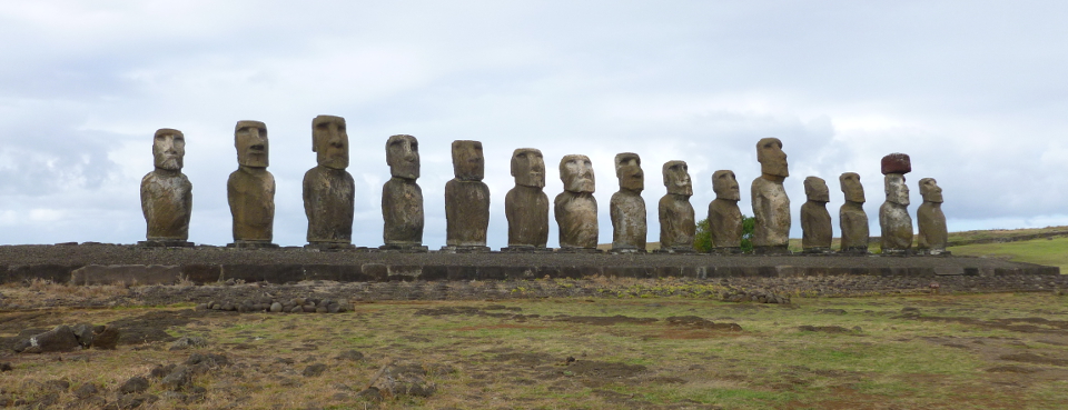
Original photo:
To increase pop, perform Colors->Auto->White Enhance then Colors->Auto->Color Enhance:
Too green. But… better than the washed-out original.
A week later, notice something called “Fade Color Enhance” appears in the Edit menu, but only after you have performed a color enhancement. If you perform a color enhancement, close the file and re-open it, you do not get this operation showing in the Edit menu.
Use Edit->Fade Color Enhancement to tone down the color on the whole picture. It gives you a preview and a sliding scale so you can see what the adjustment is doing. Get the undesired color down to where you want it, then tone up the colors you want to intensify.
In this example, select the other colors (non-green) one at a time by using Tools->Selection Tools->By Color Select, then Colors->Auto->Color Enhance.
When all the colors are done, use Select->None to eliminate the selection dashes so you can see the results. If you like it, File->Export it to JPEG. Otherwise, use the same process to intensify more colors.
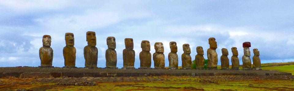
The result is at the top of today’s post (and in the new blog header image). There is not so much green on the statues.

Hi Nia!
I don’t have an eye for these things, but the picture on the header looks so much sharper. Have a great Easter Sunday. 🙂
LikeLike
Thank you, Isabel!
LikeLike