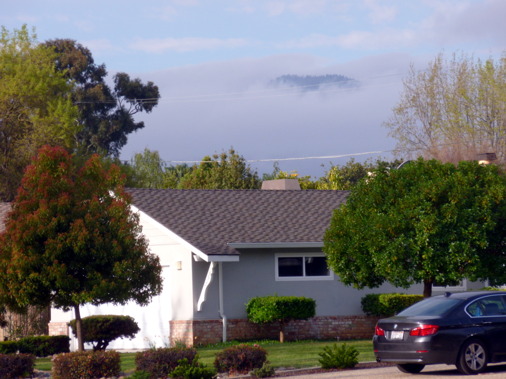
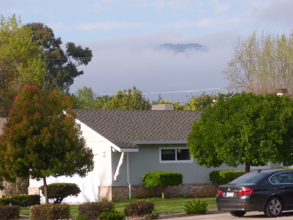
The featured photo has been enhanced using GIMP Colors->Auto->White Balance followed by Colors->Auto->Color Enhance. It is the featured image because it’s more intense, but there is too much purple in the roof, and, arguably, in the fog. Here is the original.
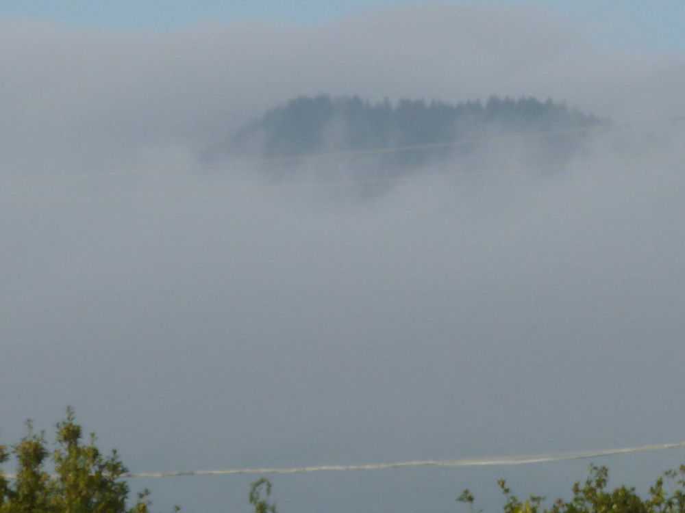
This is a close up, not enhanced. (Because it is all fog, the over-purple effect of white balance and color enhance ruined it.)
In the next set, the first is original, the second, enhanced with white balance and color enhance. Very different feelings.
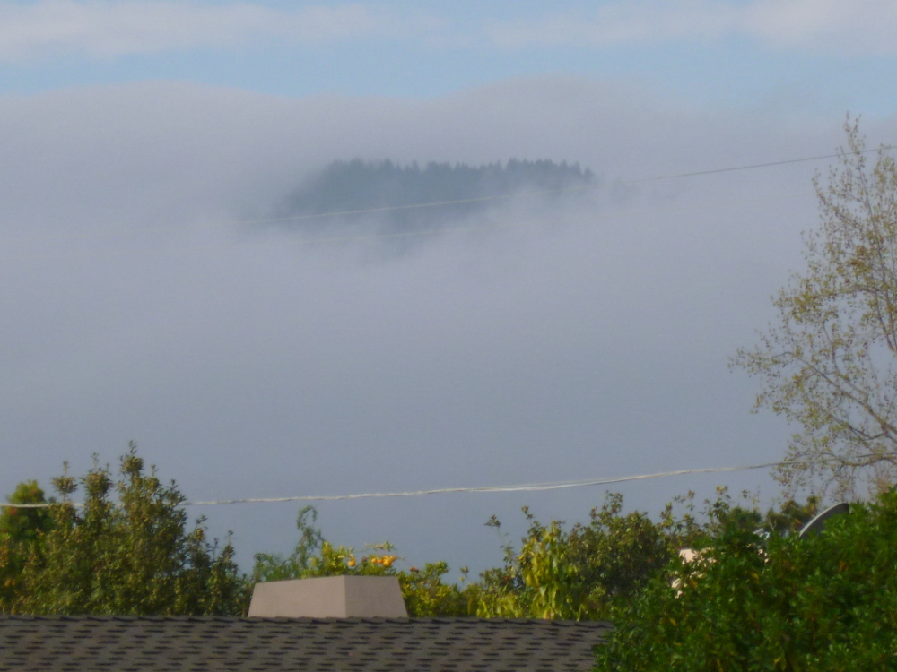
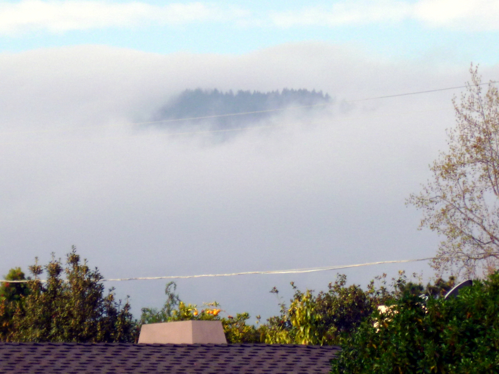

Interesting choice to use only the auto pre-sets of PS. I think I actually like the original where you are not aware that the dark form in the clouds is actually a land formation 0 it initially appears (to me anyway) to be some type of ghostly giant flying creature from a fantasy novel. 🙂 Just my take on it.
LikeLike
Thank you so much for your feedback! I am a beginner, fumbling around. I’m starting out with pre-sets until I have a chance to do the tutorials. I have had the software less than a week and received it at the same time as Corel Paint, which has riveted my attention.
LikeLike
I’ve not worked with Corel, though have tog friends that rave over it. I’m pretty old school and use PS minimally – still try very hard to get everything right in camera so I don’t have to re-touch. 🙂 Not only that, PS is a constant learning exercise which I don’t seem to have time. 🙂 Best of luck with both!
LikeLike
This is good to know. Thank you for telling me that because yes, I have found the photo enhancement time consuming to learn. I think I’ll start working on how to take better photos in the first place!
I like Corel Painting for the drawing capability. I don’t use it for photo retouch. It is a different way to sketch, paint, etc.
LikeLike