The next photo is out of focus, but included for comparison to the featured photo.
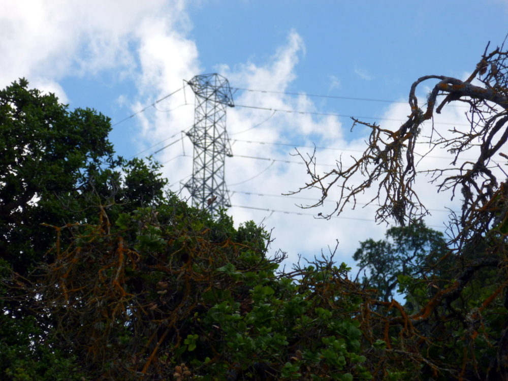
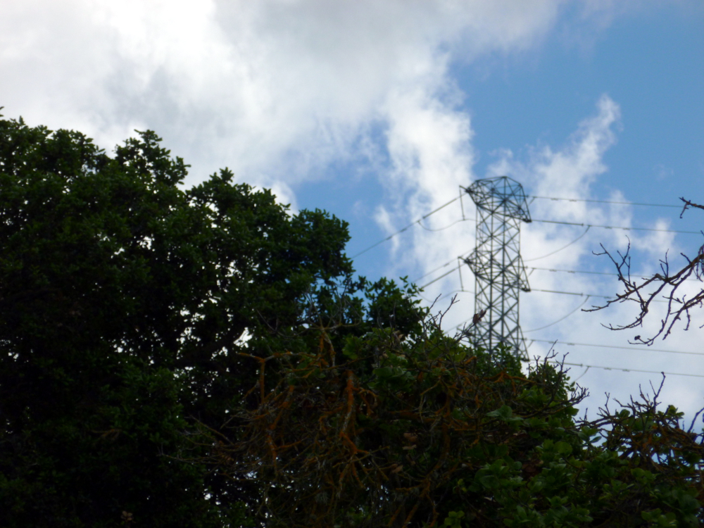
I prefer the featured photo’s composition. It looks lonely to me, and dramatic. The emphasis on the branch in the foreground in the latter picture reduces that effect, to me.
The next photo has GIMP color enhance applied, as well as white balance. All of the others have white balance only.


